您现在的位置是:网站首页>内容内容
svg+css 或者js制作打钩的动画效果CSS Transition通过改变Height实现展开收起元素从QQtabBar看css命名规范BEM的详细介绍css实现两栏布局,左侧固定宽,右侧自适应的
 2023-10-17 14:39:22
【512953070@qq.com】
662人已围观
2023-10-17 14:39:22
【512953070@qq.com】
662人已围观
简介 这篇文章主要介绍了svg+css 或者js制作打钩的动画效果,本文通过实例代码给大家介绍的非常详细,对大家的学习或工作具有一定的参考借鉴价值,需要的朋友可以参考下
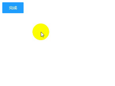
之前老板让做一个登陆后 可以显示一个打钩的效果 百度死活搜不到 今天在B站看到的一个视频居然有 根据需求改进了一下废话不多说先看效果!
html代码
打钩动画
成功
css代码
h2 {
        font-family: Helvetica;
        font-size: 30px;
        margin-top: 20px;
        color: #333;
        opacity: 0;
    }
    input[type="checkbox"]:checked+ label ~ h2 {
        animation: .6s title ease-in-out;
        animation-delay: 1.2s;
        animation-fill-mode: forwards;
    }
    .circle {
        stroke-dasharray: 1194;
        stroke-dashoffset: 1194;
    }
    input[type="checkbox"]:checked + label + svg .circle {
        animation: circle 1s ease-in-out;
        animation-fill-mode: forwards;
    }
    .tick {
        stroke-dasharray: 350;
        stroke-dashoffset: 350;
    }
    input[type="checkbox"]:checked + label+ svg .tick {
        animation: tick .8s ease-out;
        animation-fill-mode: forwards;
        animation-delay: .95s;
    }
    @keyframes circle {
        from {
            stroke-dashoffset: 1194;
        }
        to {
            stroke-dashoffset: 2388;
        }
    }
    @keyframes tick {
        from {
            stroke-dashoffset: 350;
        }
        to {
            stroke-dashoffset: 0;
        }
    }
    @keyframes title {
        from {
            opacity: 0;
        }
        to {
            opacity: 1;
        }
    }
    label {
        display: inline-block;
        height: 38px;
        width: 38px;
        line-height: 38px;
        padding: 0 18px;
        background-color: #1E9FFF;
        color: #fff;
        white-space: nowrap;
        text-align: center;
        font-size: 14px;
        border: none;
        border-radius: 2px;
        cursor: pointer;
    }
    #d1 {
        display: flex;
        justify-content: center;
        min-height: 100px;
        flex-direction: column;
    }
写到这里本来应该就结束了 但是我们在真正实现功能的时候 不太可能用 checkbox切换动画效果的显示 一般还是需要按钮操作动画效果 下面是jq操作的代码 其实用jq的.animate()更好一些但是我是小白所以就偷了个懒 (ps:好吧其实是不会)直接用.css()
JavaScript代码
  $("#btn1").on("click",function () {
       if($(this).text()==="完成"){
           $(".circle").css({'animation':'circle 1s ease-in-out','animation-fill-mode':'forwards'});
           $(".tick").css({'animation':'tick .8s ease-out','animation-fill-mode':'forwards','animation-delay':'.95s'});
           $("h2").css({'animation':'.6s title ease-in-out','animation-fill-mode':'forwards','animation-delay':'1.2s'})
           $(this).text("取消")
       }else{
           $(".circle").css({'animation':'none','animation-fill-mode':'none'});
           $(".tick").css({'animation':'none','animation-fill-mode':'none'});
           $("h2").css({'animation':'none','animation-fill-mode':'none'})
           $(this).text("完成")
       }
   });
到此这篇关于svg+css 或者js制作打钩的动画效果的文章就介绍到这了,更多相关svg css 打钩动画内容请搜索以前的文章或继续浏览下面的相关文章,希望大家以后多多支持!
热评
- Win11重启速度慢怎么办?Win11重启慢的解决方法_windows11_Windows系列_操作系统_
- 微软透露下一次更新将如何加速Win11系统_windows11_Windows系列_操作系统_
- Win11 预览版 22563 出现重大 Bug:Win + X 导致资源管理器崩溃,解决方案出炉_windows11_Windows系列_操作系统_
- Win11怎么查看网卡速率?Win11查看网卡速率是千兆还是百兆方法_windows11_Windows系列_操作系统_
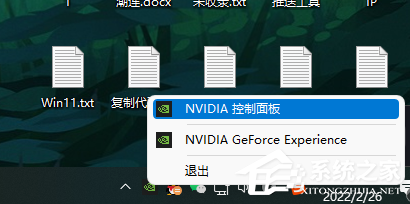
- Win11怎么设置显卡直连?Win11显卡直连设置教程_windows11_Windows系列_操作系统_
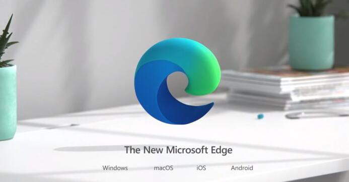
- 运行速度更快,微软 Win11/10 Edge 浏览器正测试“性能检测器”_windows11_Windows系列_操作系统_
- LTSC长期服务版!基于Win11,微软Windows Server VNext预览版25066发布(附 ISO 镜像下_windows11_Windows系列_操作系统_
- Win11如何开启3d加速 ? Win11开启3d加速的方法_windows11_Windows系列_操作系统_
- Win11无法输入wifi密码输怎么办?Win11 wifi密码输入不了的原因以及解决方法_windows11_Windows系列_操作系统_
- Win11开始菜单关机键不见了怎么办?Win11开始菜单关机键不见的解决方法_windows11_Windows系列_操作系统_
点击排行
 Win11重启速度慢怎么办?Win11重启慢的解决方法_windows11_Windows系列_操作系统_
- 微软透露下一次更新将如何加速Win11系统_windows11_Windows系列_操作系统_
- Win11 预览版 22563 出现重大 Bug:Win + X 导致资源管理器崩溃,解决方案出炉_windows11_Windows系列_操作系统_
- Win11怎么查看网卡速率?Win11查看网卡速率是千兆还是百兆方法_windows11_Windows系列_操作系统_
- Win11怎么设置显卡直连?Win11显卡直连设置教程_windows11_Windows系列_操作系统_
- 运行速度更快,微软 Win11/10 Edge 浏览器正测试“性能检测器”_windows11_Windows系列_操作系统_
- LTSC长期服务版!基于Win11,微软Windows Server VNext预览版25066发布(附 ISO 镜像下_windows11_Windows系列_操作系统_
- Win11如何开启3d加速 ? Win11开启3d加速的方法_windows11_Windows系列_操作系统_
- Win11无法输入wifi密码输怎么办?Win11 wifi密码输入不了的原因以及解决方法_windows11_Windows系列_操作系统_
- Win11开始菜单关机键不见了怎么办?Win11开始菜单关机键不见的解决方法_windows11_Windows系列_操作系统_
本栏推荐
Win11重启速度慢怎么办?Win11重启慢的解决方法_windows11_Windows系列_操作系统_
-
微软透露下一次更新将如何加速Win11系统_windows11_Windows系列_操作系统_
-
Win11 预览版 22563 出现重大 Bug:Win + X 导致资源管理器崩溃,解决方案出炉_windows11_Windows系列_操作系统_
-

Win11怎么查看网卡速率?Win11查看网卡速率是千兆还是百兆方法_windows11_Windows系列_操作系统_
-
Win11怎么设置显卡直连?Win11显卡直连设置教程_windows11_Windows系列_操作系统_
-
运行速度更快,微软 Win11/10 Edge 浏览器正测试“性能检测器”_windows11_Windows系列_操作系统_
-
LTSC长期服务版!基于Win11,微软Windows Server VNext预览版25066发布(附 ISO 镜像下_windows11_Windows系列_操作系统_
-
Win11如何开启3d加速 ? Win11开启3d加速的方法_windows11_Windows系列_操作系统_
-
Win11无法输入wifi密码输怎么办?Win11 wifi密码输入不了的原因以及解决方法_windows11_Windows系列_操作系统_
-
Win11开始菜单关机键不见了怎么办?Win11开始菜单关机键不见的解决方法_windows11_Windows系列_操作系统_